Jesse Richardson profile photo

JESSE
RICHARDSON

UX Research & Design

My Motivation

Throughout my career, I have consistently demonstrated a user-centric approach, focusing on identifying business needs and translating them into actionable strategies. In my current role at Meta, I play a key role in scaling product offerings by overseeing research projects within an emerging category. I am confident that I can bring the same level of dedication and expertise to any challenge within a targeted role.


Projects

Wishlist Wardrobe Logo

Wishlist Wardrobe

Graduate HCI Project at RIT

Project Overview

Wishlist Wardrobe is a centralized virtual wardrobe application designed to address the disjointed nature of online shopping. Currently, shoppers face cognitive overload managing multiple tabs, sizing inconsistencies across brands, and a lack of visualization tools. This project aimed to create a unified platform where users can collect items from any store, visualize outfits using AI/AR, and manage wardrobes for multiple individuals (e.g., family members or clients).

Research & Discovery

Contextual Inquiry

Our team conducted field observations and contextual inquiries to understand user behaviors. We discovered that while online shopping is convenient, it often leads to decision fatigue. Shoppers frequently rely on "multi-tab shopping" to compare items and depend heavily on customer reviews to mitigate sizing risks. A key finding was that users often buy multiple sizes to guarantee fit, leading to increased return workloads.

Data Modeling

Personas and Task Analysis

We developed personas based on our research, including "Hailey," a busy parent needing efficiency, and "Marcus," a fashion consultant needing to organize outfits for clients. We utilized Hierarchical Task Analysis (HTA) to map the complex workflow of shopping for multiple people, focusing on reducing memory reliance and preventing errors during the checkout process.

Design Phase

Prototyping & Architecture

We created a sitemap and low-fidelity prototypes to structure complex features like the "Shared Closet" and "Multi-Cart" systems. The High-Fidelity prototype refined these concepts, introducing a "Style Feed" for social discovery and a "Smart Search" filter. The design adhered to Hick’s Law to minimize choice paralysis and Jakob’s Law to ensure familiar navigation patterns.

Evaluation & Iteration

Usability Testing

We conducted usability testing with four participants. The pilot study revealed that while the concept of multiple carts was useful, it introduced friction. Additionally, participants reacted negatively to AI-generated imagery on the landing page. Based on this, we removed the AI imagery, redesigned the search filters to match standard e-commerce mental models, and improved the distinction between "Closets" and "Carts" to reduce cognitive load.

Corporate Directory Home

Corporate Directory for Compact Screens

Graduate HCI Project at RIT

Project Overview

This project explored the design of a corporate directory application for the Apple Watch. The goal was to support employee discovery within a large organization while respecting the constraints of an extremely compact screen and limited input methods.

Design Constraints

  • Small screen real estate with minimal tolerance for padding
  • Shallow interaction depth preferred by watchOS guidelines
  • Need to support organizations with 40,000+ employees
  • Quick, glanceable interactions over prolonged use

Research & Guidelines

Apple’s watchOS Human Interface Guidelines informed core decisions around layout, hierarchy, and control density. Although Apple discourages deep hierarchies on watchOS, this constraint was intentionally challenged to explore edge cases for enterprise-scale data.

Initial Concept

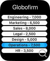
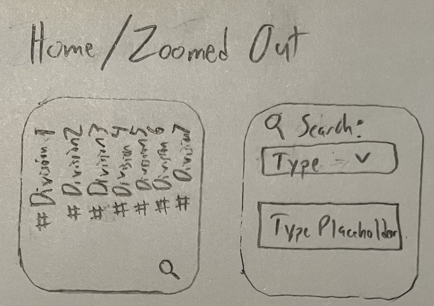
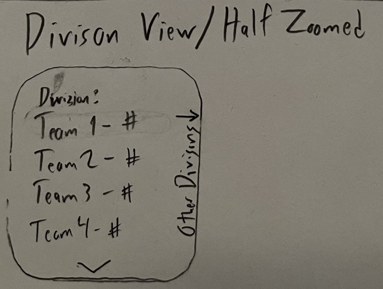
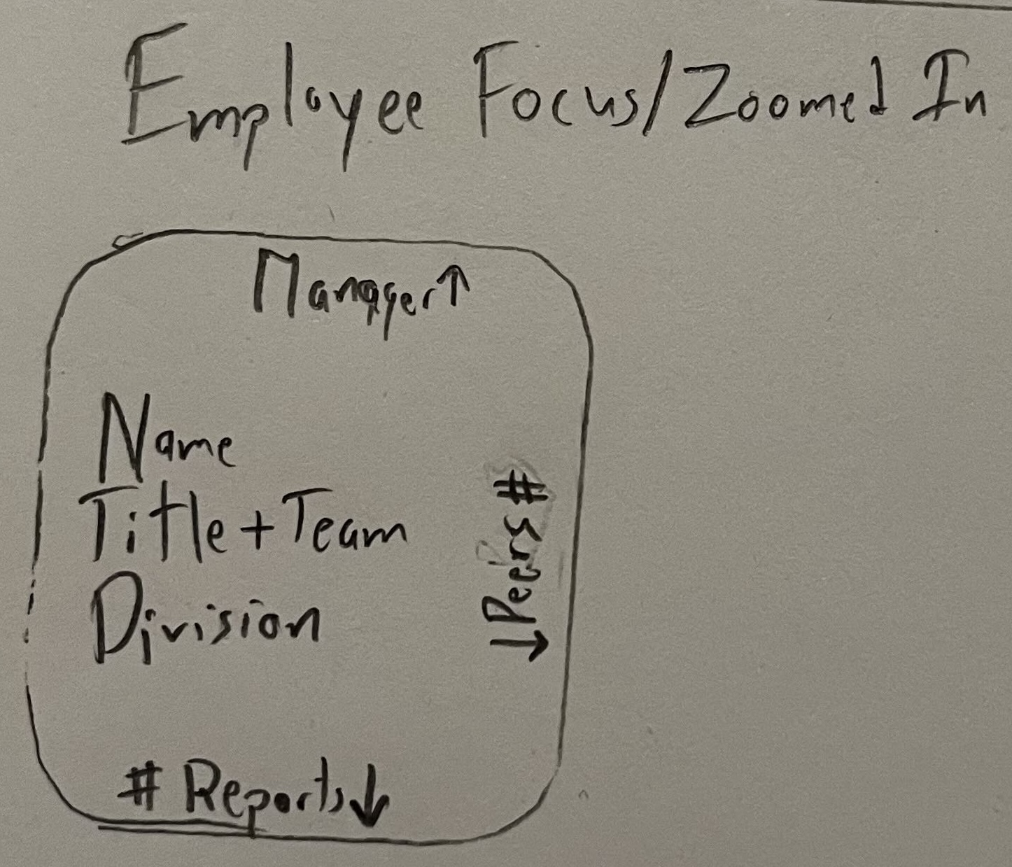
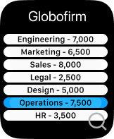
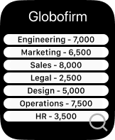
Early sketches proposed a vertically organized directory with divisions displayed on the home screen, each paired with employee counts and a global search option. Selecting a division revealed teams, and eventually individual employee profiles.

Refinement & Iteration

The design was refined in Figma using Apple’s watchOS UI Kit. Vertical text layouts were abandoned due to legibility issues, and divisions were reoriented horizontally for improved readability and alignment with platform conventions.

User Flows

Search Flow

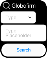
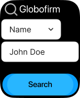
Users can search by division, level, or employee name using a dropdown selector and text input. Results dynamically update once valid input is entered.

Select Flow

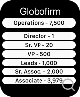
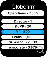
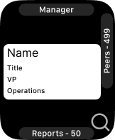
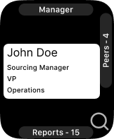
Users can browse divisions directly from the home screen, drill down into organizational levels, and view individual employees. Peer and report navigation supports lateral exploration without excessive backtracking.

Key Takeaways

  • Readable hierarchy is more critical than visual novelty on compact screens
  • Persistent global navigation reduces cognitive load
  • Enterprise data requires controlled violations of platform guidelines
  • Glanceability and discoverability must be carefully balanced
Nutrition Challenge Logo

Nutrition Challenge Dashboard

SoHookd.com

The Research Phase

Interviews and Benchmark Research

The research phase began with interviews to understand user needs, pain points, and existing behaviors related to nutrition challenges and wellness platforms. This was followed by benchmark research to analyze competitors and industry standards. Key insights gathered helped in defining the project's scope and design direction.

Sketches and Wireframes

Initial sketches and low-fidelity wireframes were created to visualize the user flow and layout. This iterative process focused on simplicity and clarity, addressing user needs identified in the research phase. The wireframes provided a foundational blueprint for the platform's interface, with a focus on intuitive navigation and accessible information.

User Testing and Key Takeaways

User testing was conducted to validate the design concepts. Feedback from users helped refine the platform's features and overall experience. Key takeaways from this phase included the importance of a simple, easy-to-understand challenge selection process and clear progress tracking.

The Design Phase

Simple Select and Account Screens

The design phase brought the wireframes to life. A key feature, "Simple Select," was designed to streamline the challenge sign-up process. The account screen was also redesigned to provide users with a clear overview of their progress and easy access to their profile and wellness resources.

Nutrition Challenge Dashboard with Simple Select
Airline Website Logo

Airline Website Case Study

UX Design Institute

Project Context

This project was completed for the purposes of learning, understanding and using the design process. The main goal was to take research findings, analyze and conceptualize them, and design an airline website that created a better experience for users.

Research

User Interview and Testing

I completed 3 interviews directly followed by a usability test of 2 competing airline websites. Findings included: Users use aggregator sites for comparison and visit airline sites when ready to book; Brand loyalty is prevalent; A clear flow is important.

Analysis

Affinity Diagram & Journey Map

I used affinity diagraming to break down my research findings into understandable groupings. The Customer Journey Map added structure and emotion tracking. Users typically have a better experience during data-entry and a less than optimal experience when interpreting large amounts of information.

Design

Sketches & Prototypes

Sketching gave me a visual on the user's experience, focusing on clear presentation and flow. I focused on "Less clicks = Better," "Avoid Redundancies," "Clarity is key," and "Keep fare-levels simple". I created a medium-fidelity prototype using Figma and Invision.

iOS Clock App Logo

iOS Clock Application

Redesign Experiment

The Problem

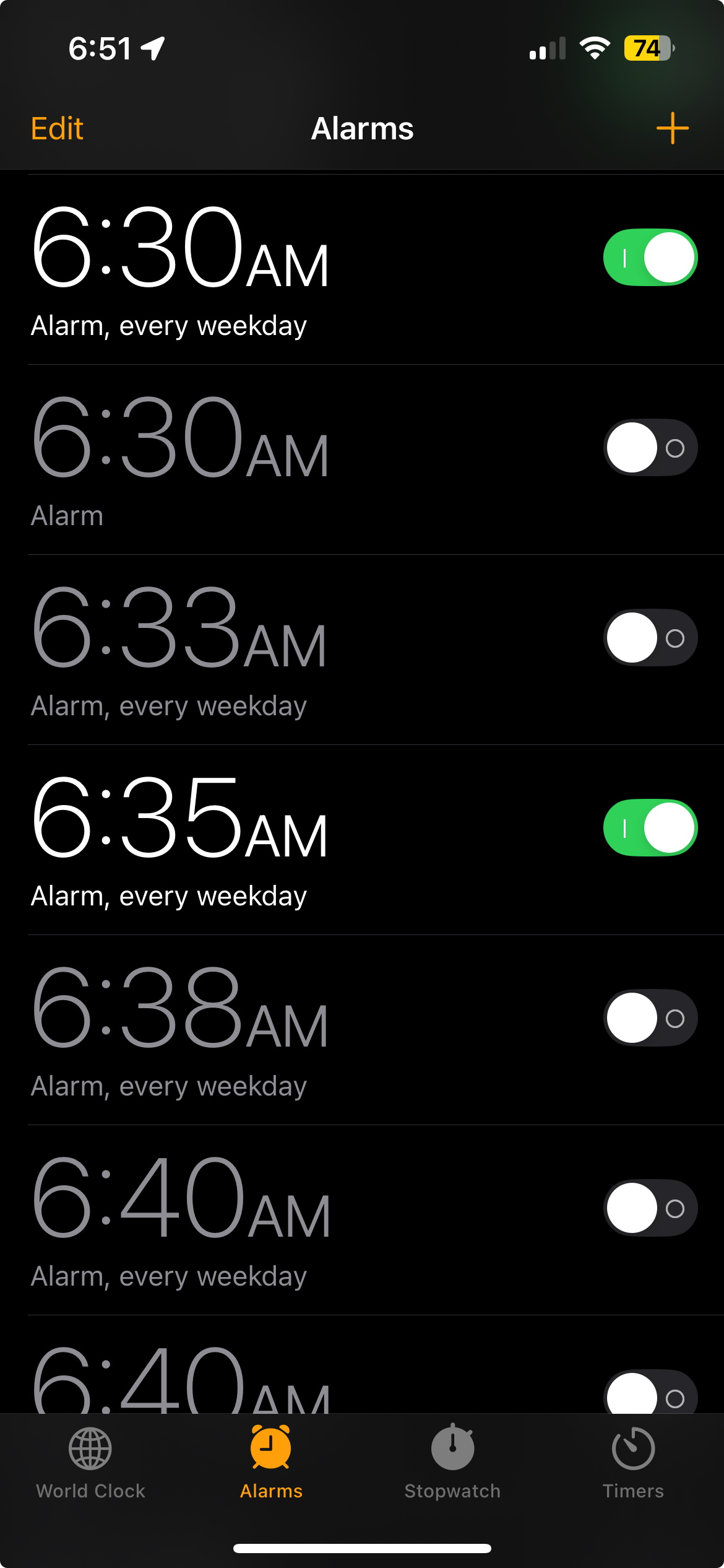
My mother noticed how many nonactive alarms I had in my alarm list. She told me that when she turns off an alarm, it deletes itself. Through an impromptu usability test, I learned that the iOS Switch control used to turn alarms on/off was misleading her, as the gesture to swipe like a switch is the gesture used to delete an alarm. Problem: iOS Switch control offers incorrect affordances.

Research

Interviews and testing were done informally and in-person. The goal was to affirm or dispute my initial theory that the Switch control offered the wrong affordances. 4 users completed the test. Findings: 3 out of 4 users deleted the alarm by swiping when they were attempting to turn off an alarm.

Design

The goal was to create a dead-simple redesign of the iOS Switch control. The outcome was a control that had an unmistakable function. Using Figma, I created a medium-fidelity prototype. 2 users were tested. Boxes with rounded corners were added to each button. This addition was retested and users had no trouble interpreting the control.


Notable Experiences

Experience

Meta Logo

Project Manager

Oct 2024 to Present

  • Led multiple full project lifecycles for human-centered data collection efforts, from planning to delivery.
  • Developed project strategies, ensuring alignment with organizational objectives and the needs of human subjects.
  • Cultivated strong relationships with stakeholders and managed project resources.
  • Utilized project management methodologies to ensure projects were completed on time and within scope.
Meta Logo

Project Coordinator

Aug 2024 to Oct 2024

  • Supported project management team in creating and maintaining project plans and timelines.
  • Managed project documentation and coordinated project meetings to facilitate team communication.
  • Facilitated communication between cross-functional teams and internal data partners.
  • Tracked project progress and provided status updates to management and internal data customers.
Meta Logo

Research Assistant

Apr 2022 to Aug 2024

  • Contributed significantly to scaling product offerings by overseeing projects within an emerging category.
  • Managed and optimized digital asset libraries, ensuring smooth operations across multiple projects.
  • Orchestrated technical research inquiries, by aligning with stakeholder goals to achieve project milestones.
  • Authored comprehensive technical documentation, including process maps using Lucid Chart and standard operating procedures.
WEVO Logo

Digital Analyst

Jan 2022 to Apr 2022

  • Analyzed user-experience data and presented insights through data visualization, aiding client decision-making.
  • Developed prototypes to test new concepts and compiled findings into actionable reports.
SoHookd Logo

UX Design Intern

Sep 2021 to Dec 2021

  • Led UX design for a health service platform, incorporating user research and feedback to refine product offerings.
  • Conducted interviews and A/B tests to inform product requirements and enhance user experience.
Redfin Logo

Client Strategy Lead

Aug 2020 to Apr 2022

  • Managed 35+ real estate deals, generating over $10M in sales, and improved lead conversion by 20%.
  • Ensured high client satisfaction by deploying a client-centric strategic management approach, maintaining a 97% satisfaction rate.

Education

RIT Logo

Master’s of Science in HCI

Rochester Institute of Technology · Expected Spring 2026

UX Institute Logo

Professional Diploma in UX Design

Glasgow Caledonian University, UX Institute · Mar 2021 to Jun 2021

Robert Morris University Logo

BS in Business Administration

Robert Morris University · Aug 2013 to May 2017


Contact

Email: jrich2095@gmail.com

LinkedIn: jesserichardson1